How brand logotypes have had to evolve in our digital world
For years now we’ve seen companies gradually making their logotypes less complex. Think Ebay. Remember those layered characters in differing fonts? And Google moving to a simple clean font?
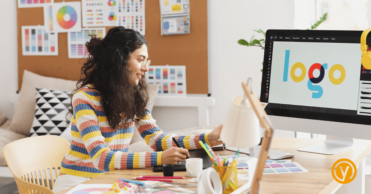
It’s common for companies to gradually filter and refine their logos over time. Now with the increasing need for digital solutions, logos have had to evolve in numerous ways to keep up with the changing landscape.
Many have streamlined their logos in recent years – reducing the number of colours, simplifying shapes and removing unnecessary details. Mastercard updated its logo in 2016, modifying its design to just two overlapping circles and completely removing its text.
Logotypes must also now be created with responsive design in mind, to adapt to different screen sizes and resolutions to perform. This is particularly important for use on mobile, given their smaller screens and differening aspect ratios.
Animation also now features in logotype digital formats. This is allowing companies to add a dynamic element to their branding and make their appearance more engaging for customers – Google’s Doodles are a perfect example.
Versatility is also key to ensuring that branding can be used across a range of digital and physical platforms. So that’s orientations (horizontal, vertical), as well as other variations such as ranges of backgrounds and differing executions.
Then there’s brand extension. Companies are increasingly using their logos in this way – creating icons, emojis, and other graphical elements that can be used in their digital comms. Twitter has even created an entire library of Twitter emojis based on its iconic blue bird logo.
I’ll add one comment here, as a graphic designer myself and a long-time crusader for strong, well-considered, strategically led design…
While simplicity, versatility and responsiveness are important, creativity will always be the foundation upon which effective logos are built. No amount of digital wizardry will help if a brand’s logotype design is weak, doesn’t accurately reflect the organisation or is irrelevant to its customers.
If you’d like to know more about our thoughts on brand logotype design and/or know that yours doesn’t do your business justice, then get in touch.
We’ll solve that and more for you.
You can contact us at hello@yellowyoyo.co.uk, call 01908 980 400 or leave a message here.
Amanda